Thing practiced: data visualization
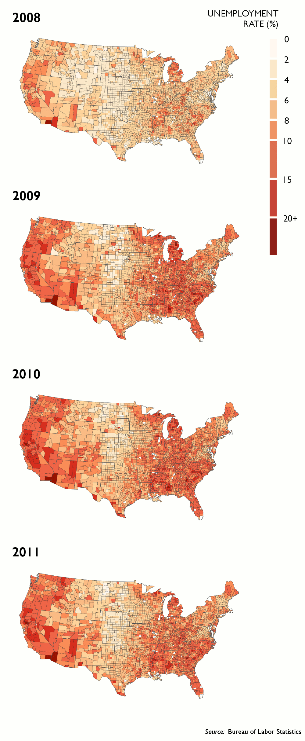
For today’s practice I tried to recreate the graphics in Nathan Yau’s unemployment map from 2009 using R and ggplot2.
Code for the solution is here.
The Bureau of Labor Statistics makes state-, region-, county-, and city-level unemployment data available in flat files via FTP here. I used mapping data from the R maps library to draw the regions, but the county names there don’t match the BLS county names exactly – I removed references to “County”, “Parish”, and “City” in the county names to solve some of the mismatch problems, but a few counties are still missing. Also, I didn’t bother plotting and insetting Alaska or Hawaii.
The result (this would’ve been more interesting if I’d waited until the 2012 data was released, but still):
